Your website visitors take only 5 seconds to decide whether to stay or not.
This clearly shows that website design has to be super engaging to get your visitors to stay, and drive them down the sales funnel. That’s why you need to follow these web design best practices to optimize your site.
1. Optimize your page load speed
When we land on a webpage, we expect it to load within 2 seconds. If it takes longer than that, we may get impatient. There is data to back this argument as well.
According to data from Google, the probability of users bouncing off from a site increases by 32% when the page load time goes from one to three seconds.
Furthermore, if the page loading speed increases to six seconds, the probability of bounce increases 106%.
Because consumers are often rushing, their patience is reaching an all-time low. So the first thing designers need to do is optimize the page load speed. Here are some ways to do just that:
- Compress anything that can be compressed.
- Optimize your code and take out any unnecessary characters.
- Remove render-blocking scripts.
- Check your server response times.
- Minimize image size.
You can use Google PageSpeed Insights to test your site and find other opportunities to speed up your page.
2. Make it accessible for all
Anyone with access to a computer and an internet connection should be able to visit your website, regardless of their circumstances and abilities.
However, many business websites aren’t accessible to users with disabilities. According to the World Health Organization, roughly 15% of the population is dealing with some form of disability, which many times prevents them from utilizing the web.
To cater to everyone, you should design a website that is compliant with the Americans with Disabilities Act so that people with a wide array of disabilities can browse. This will also help you avoid any lawsuit connected to a non-compliant web design.
The Web Accessibility Initiative shared the Web Content Accessibility Guidelines (WCAG) that you need to follow to make your website ADA-compliant. Complying with these guidelines will ensure that your site is accessible to all users.
Many business owners find it difficult to meet all of these guidelines. You can utilize the automatic web accessibility solution by accessiBe for help. It allows visitors with specific disabilities to adjust the user interface of your website to meet their personal needs.
Additionally, their artificial intelligence-powered engine remediates all HTML issues and orients the functionality and behavior of your site for screen readers and keyboard navigation. To ensure that new content uploads don’t affect the accessibility level of your website, it is optimized every 24 hours.
3. Add strong and clear CTAs
A call-to-action is how you get your clients through the sales funnel. Without clear CTAs, your visitors have no idea where they are supposed to click next.
Ultimately, a well-designed website has clear CTAs that push conversion rates higher. It is the job of the user experience team to do a lot of A/B testing on various landing pages to see what works best.
Great CTAs have certain common elements, such as:
- They are easily visible without disrupting the user’s browsing experience
- They follow the natural flow of your hand movement
- Contain an easy clear message such as, “Download for Free,” or “Learn More”
If there is a lack of good CTA implementation, you are going to have high bounce rates. Visitors will quickly scan your content and then leave.
What do you need to consider when designing your CTAs?
- Size — Generally, make sure your CTA is very visible on all devices. Larger buttons tend to have a higher chance of receiving clicks. At the same time, it should not be too large so as to distract visitors from the rest of the content.
- Color and shape — When you consider the color, it needs to be in contrast to the rest of the colors around it. The shape has to be compelling enough to make you want to click it.
- Placement — Place CTAs where the visitors can easily see them. There is a lot of consumer psychology behind the placement of buttons. According to research by Nielsen Norman Group, there are two basic patterns in which people scan a page: the F pattern and the Z pattern. These patterns help designers identify the best placement for the CTAs. F patterns are more common in websites with large amounts of content, such as blogs and news portals. Z patterns are common for websites with less content, for example, landing pages.
- Copy — The microcopy on the button needs to be concise and transparent. If you want people to buy something now then use “Buy Now” and not “Learn More.” If you are giving away a freebie then use “Download for Free” and not “Get Access.”
Here’s an example of perfect CTA placement, color, shape and copy from Netflix.
4. Ensure easy site navigation
Among your top priorities when you think website design is the ease of navigation. Your visitors will use the navigation to find any relevant information they are looking for.
Without clear navigation, you end up with disappointed visitors that exit your website for better alternatives.
What creates a great navigation experience?
- Structure — The structure needs to be clear and predictable for faster results.
- Minimalism — The navigation has to be user-friendly and simple.
- Design — Your design has to reflect your branding guidelines, but you should also use harmonious colors and shapes for a pleasant visual experience.
Survey Analytics has a great navigation system in place, exhibiting all necessary design elements in structure, minimalism and design.
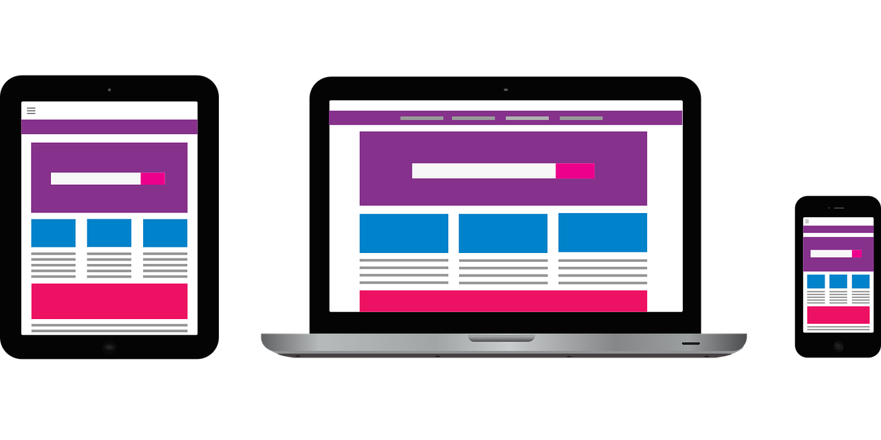
5. Make your website mobile-responsive
The responsiveness of a well-designed website needs to be fluid and adjustable to all devices. It is especially critical to make it mobile-responsive as the number of users on mobile continues to increase annually.
Mobile screens are smaller and this is why navigation and CTAs need to be optimized accordingly.
For example, try to keep the main CTA on the main screen as well as at the bottom of the screen. Also, vertical scrolling is more effective than horizontal.
It is important to optimize the e-commerce function on the mobile version of your design as well, giving your customers instant access. If the prospect has to abandon the mobile experience to turn on their computer and finalize the transaction, you risk losing that sale.
6. Leverage technical SEO
The importance of SEO is well established. Without it, search engines cannot find you.
But what is technical SEO?
Technical SEO involves optimizing your website and servers so search engine spiders crawl to index your website better for improved organic results. While it mainly concerns on-page ranking factors, it also involves several off-page SEO ranking factors as well.
How can a designer ensure good technical SEO?
- Smaller images to make sure the speed is not compromised
- Collaboration with reputable hosting services (DNS Lookup and SSL Certification)
- Caching versions for better speed
- Rich content
- Keywords
- File names
Technical SEO can be tricky. However, the main rule is to remove all possible roadblocks between the website design and Google.
You can use tools like SEOptimizer to audit your site for any technical SEO issues that you need to address. This tool rates your site and gives you suggestions on improving several aspects such as SEO, usability, performance, etc.
7. Select a clean and minimal design
Clean and minimal design is part of a good navigation system as we discussed above.
However, it is deserving of a second mention. In this section we highlight all the reasons why a clean and minimal design is important:
- Timeless
- Easier to scan and understand
- More accessible
- Less pushy and more confident
- Loads faster
- Highlights fewer distractions, therefore, increasing conversions
- Easier to maintain
8. Keep branding consistent across your website
Consistency is professionalism and it helps your clients trust you.
Let’s use a silly example of a friend of yours, who is constantly changing opinions, personality traits and tones of voice. How much would you trust anything they say?
The same principles apply to brand consistency.
Consistency in web design will:
- Make your brand recognizable
- Build brand equity and trust
- Promote professionalism and a clear mission/vision
- It establishes and reinforces your brand personality
PayPal has been a brand name for online transactions. No matter who else comes on board, PayPal is consistent and its easy-to-use platform has a friendly interface.
9. Design effective forms
Great online forms will give you more leads, which then results in higher conversions.
According to HubSpot, 74% of marketers say they use web forms in their lead generation efforts. Additionally, 49.7% of marketers consider web forms to be their highest converting lead generation tool.
So how can design help you take advantage of forms?
- Simple forms work the best
- Straight-forward questions give better answers (no one likes to feel that they are being tricked)
- Start with the easy questions first, and then, if you have to ask, ask the hard ones at the end
- Give a compelling title to your form
- Utilize drop-down menus when the question allows for it
10. Conduct regular A/B tests
Conducting regular A/B testing on the website enables you to skip unnecessary risks and maximize your resources.
A/B testing is especially important right before the website launch or new product launch. It helps the team find out what performs better, instead of just assuming.
How do you perform A/B testing?
- Test one thing at a time.
- Determine your control and a challenger.
- Always have a particular goal. For example, are you testing the placement of the button, the appeal of a certain color choice, etc.?
- Test for all design elements that are important such as placement, color and size.
- Allow your testing enough time to produce adequate data.
Once you have enough data to make a decision, go ahead and implement the most favorable results to your web design.
11. Optimize your page layouts
Finally, we need to evaluate the page layout and make sure it works as it should.
What is page layout optimization?
Page layout optimization takes care of all of the rest of the details that you might not have worried about until now, including:
- Footers and navigation links
- Videos, images, and keywords
- Final edits for all text-based titles to help Google find and index your hard work
- Final edits on all CTAs and online forms
- Payment funnel optimization
- Any other elements not optimized in previous steps
Make web design a top priority
Your website design has as a primary function to be the initial hook for your visitors. When best practices are correctly implemented, the user experience is elevated to create an emotional connection between your brand and the visitor.
Remember to start with compliance, make sure you are not at risk for any lawsuits, and then move on to the fun parts!
Gaurav Sharma is the founder of Attrock, a digital marketing company. He works closely with top marketing influencers and has helped numerous brands, e-commerce firms and SaaS companies grow. He is also a certified Google Analytics and Google Adwords specialist and regularly contributes to reputable publications like HuffPost, TechCrunch and many more.
If you enjoyed this article, sign up for SmartBrief’s free daily email on Social Business. It’s among SmartBrief’s more than 250 industry-focused newsletters.